Color has power. Whether you’re reimagining your cozy cottage or giving a stately brick home a facelift, the right color combination instantly sets the mood and tells a story before anyone steps inside.
Let’s wander through some enchanting pairings that turn heads and make coming home feel brand new.
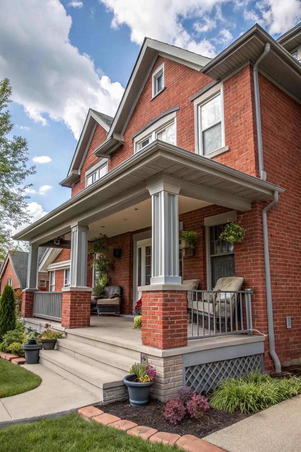
Sometimes, all a classic red brick home needs is a gentle hand. Soft gray paint for trim weaves a feeling of calm around bold brick, acting like a cozy cashmere wrap on a chilly evening—subtle, yet deeply inviting.
Why does this palette work so beautifully? Gray acts as a neutralizer, softening the intensity of brick’s rust and red tones. The secret is to choose a shade with the right undertone—cooler for a crisp, urban look, or warmer for added coziness. It’s this delicate balance that lets the brick’s personality shine, while whispering, ‘Come closer.’
There are a couple of practical steps I always follow for a harmonious finish:
- Test paint patches next to your brick at different times of day—light changes everything!
- Accentuate entryways or porch details in the same gray to tie the look together.
I had the pleasure of guiding Sarah—a busy mom with impeccable taste—through an exterior refresh for her family’s home. Instead of overpowering the natural charm of her red brick, we chose a gentle, mid-tone gray for the trim and porch railings. The result? A home that feels instantly calm and connected, day or night, rain or shine.
When you want your house to feel welcoming but quietly refined, this combination is pure magic.
These products might help:
2. Red Brick, Creamy Dream: A Palette That Plays Well With Everyone
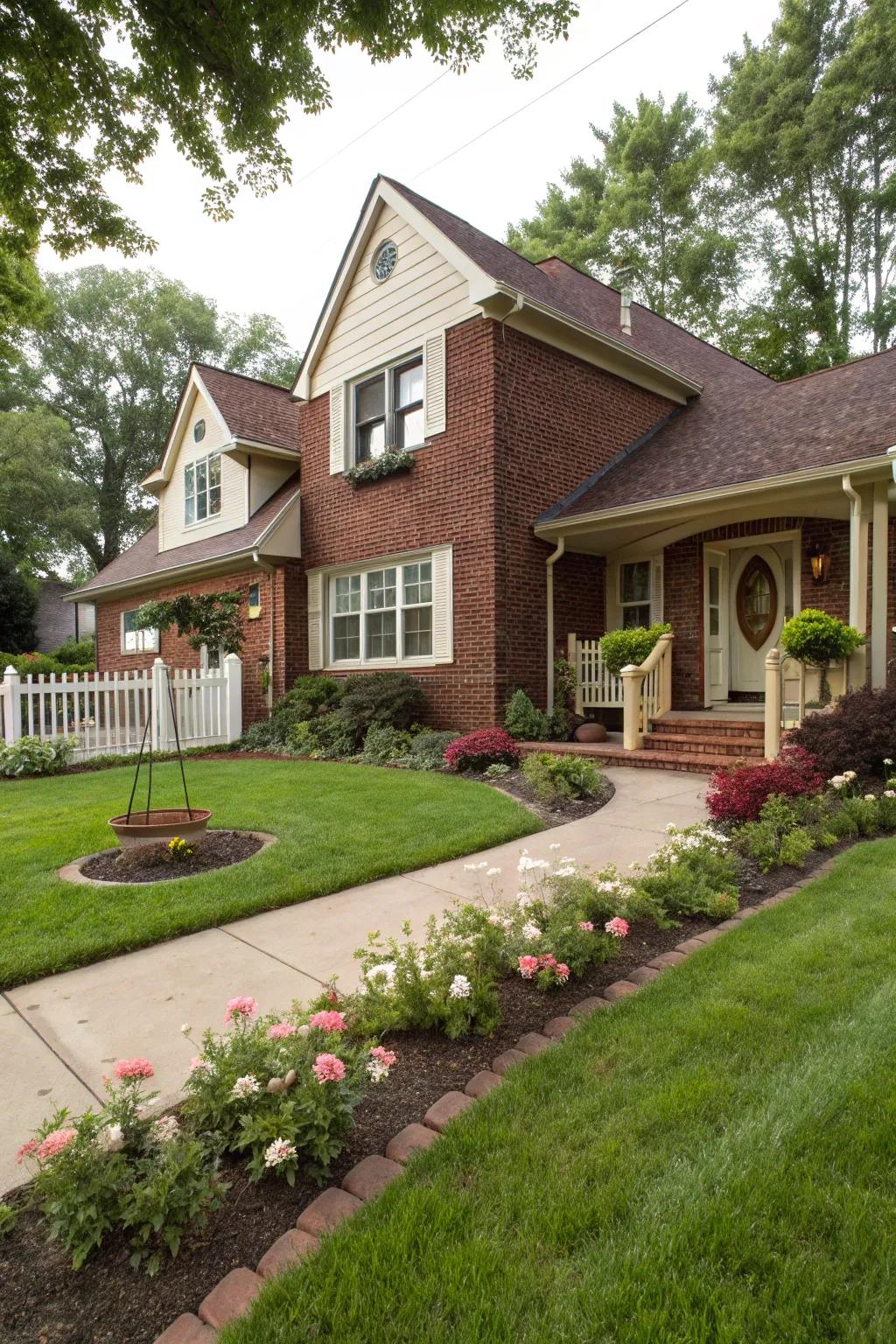
Dark red brick offers strength and tradition, while creamy beige introduces a softness that feels both classic and contemporary. It’s a palette that instantly feels like home, no matter your architectural backdrop.
I’m reminded of the time I worked with James and Priya, who had just moved into a historic brick farmhouse. They dreamed of an exterior that honored the home’s roots but added a welcoming, modern twist. We went with creamy beige for the trim and entryway, letting the deep red brick take center stage while the beige provided a gentle contrast.
Just a few simple upgrades can really transform a brick-and-beige ensemble:
- Update window frames and doors with creamy beige paint for a clean, cohesive look.
- Layer in classic accents, like wrought iron hardware or soft outdoor lighting, to highlight the rich brickwork.
Sometimes, the subtle choices become the showstoppers.
This combination is perfect for those who crave warmth but want a look that stays fresh for decades. The versatility of this pairing means you can go as traditional or as modern as you like, while always feeling right at home.
You might like:
3. White Brick with Black Trim
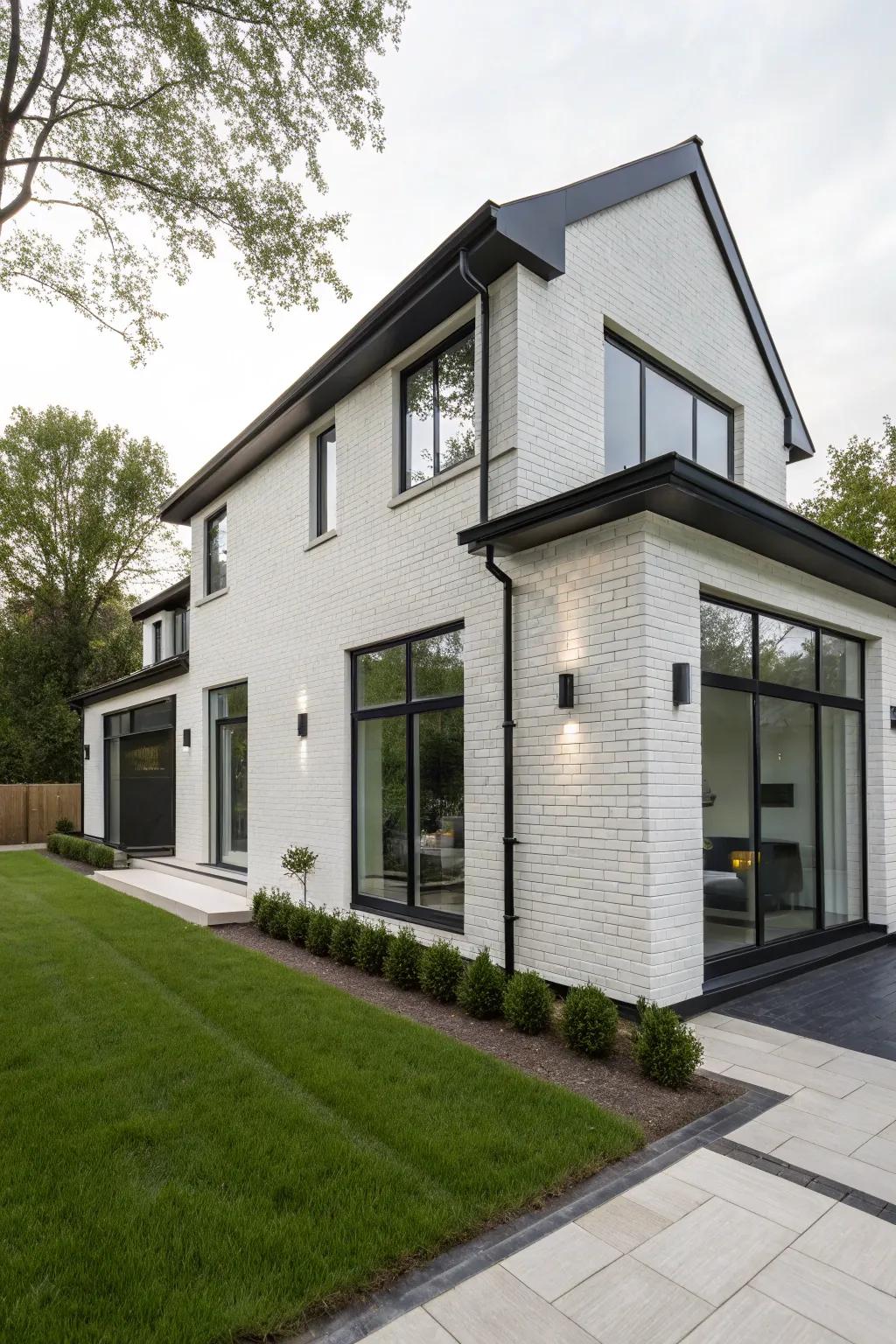
White brick with black trim provides a striking and contemporary look. This high-contrast palette gives your home a modern edge and timeless appeal.
Check these products out:
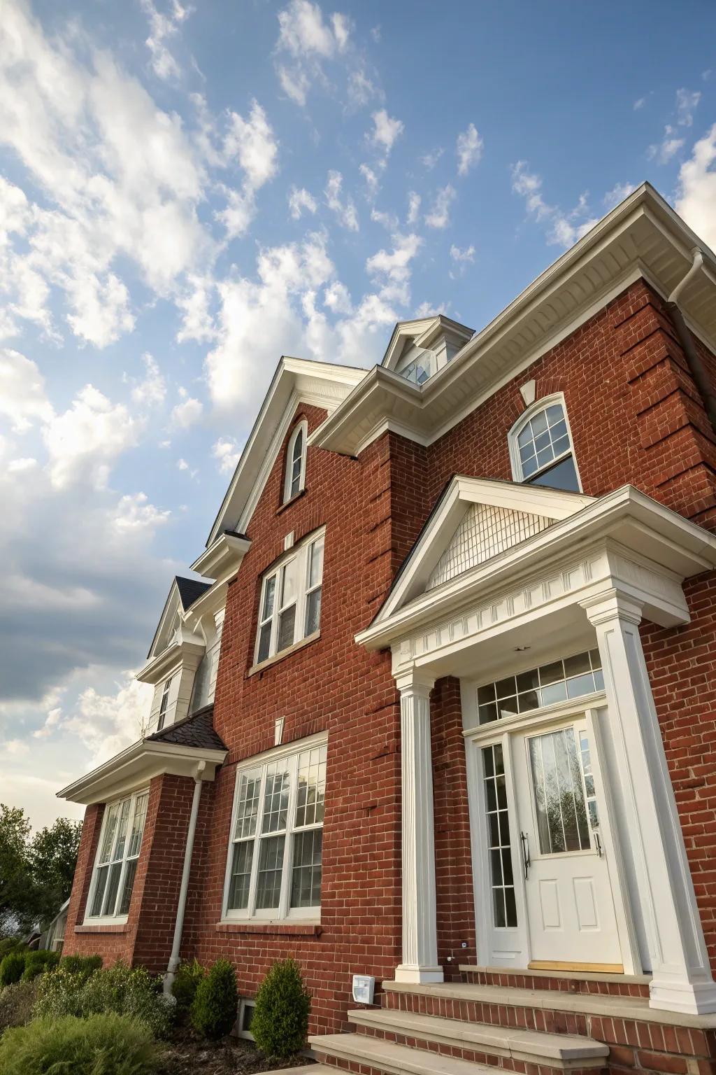
Is there anything quite as inviting as a classic red brick home trimmed in velvety white? I often ask my clients this when we’re dreaming up their curb appeal together—because this combination just never goes out of style. It’s like the little black dress of home exteriors: always elegant, always noticed.
When you pair bright, clean white with the rich warmth of red brick, something magical happens. The contrast makes even the smallest architectural details pop—arches, sills, and columns take center stage. Fresh white keeps the overall effect light and inviting, while allowing the natural beauty and depth of brick to shine through.
Here are a few practical ways to elevate this look:
- Play with gloss levels—satin or semi-gloss for trim to make it pop.
- Use wide, classic shutters to frame windows in white for an extra stately effect.
- Consider painting the front door white for a cohesive, sophisticated entrance.
Little touches matter just as much as big gestures.
I once worked with the Thompsons, who’d just purchased their first home and wanted it to truly reflect their classic tastes. We chose a balanced white for all their trim—even the porch columns—and added charming white shutters. Their façade went from faded to fabulous, welcoming guests with a perfectly polished look that never feels forced. If you’re drawn to timelessness, this combo is truly foolproof.
Might be a good match:
5. Embracing Nature: Earthy Tones Meet Warm Beige Brick

There’s something about earthy tones paired with warm beige brick that feels right at home—like freshly-turned soil and the leaves after rain. It’s the kind of look that quietly says, ‘Relax, you’re exactly where you belong.’
If you’re craving a palette that’s gentle on the eyes but full of character, this blend is made for you. Here are a few ways I recommend creating harmony with these hues:
- Paint trim and doors in muted, botanical shades—think sage, olive, or moss.
- Choose landscaping that echoes the earthiness, like ornamental grasses or lavender.
- Use natural materials—stone, wicker, or wood—for planters and fixtures.
- Let your lighting be soft and golden, mimicking sunset.
Let your home’s colors whisper rather than shout.
What small detail would bring out the best in your brick? A thoughtful palette can turn your exterior into a natural sanctuary.
Consider these options:
6. Why Taupe? A Subtle Showstopper
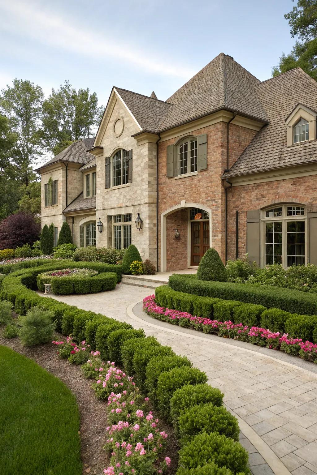
There’s something quietly stunning about natural brick highlighted with taupe. This pairing doesn’t shout for attention—it simply exudes sophistication. Taupe is understated yet versatile, giving classic brick a modern twist.
Try painting just the trim or window frames for a gentle accent that doesn’t overwhelm. Or focus on the entryway to create a subtle but defined focal point.
Sometimes, the most beautiful choices are the most understated.
Check if these fit your needs:
7. Nature’s Embrace: Rustic Browns Meet Olive Greens
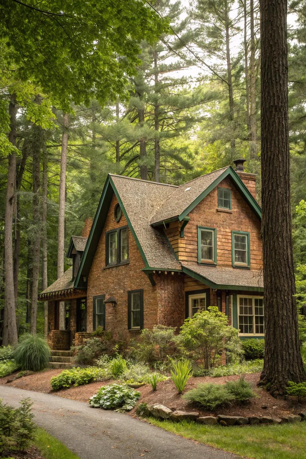
Imagine coming home to a space that feels like it grew right out of the landscape. That’s the magic of pairing rustic brown brick with the tranquil elegance of olive green. Together, these colors ground your home in the warmth of tradition and the calm of nature.
Whether you’re updating a front door, window shutters, or porch decor, it helps to layer textures and tones. Here are several ways to bring the look to life:
- Blend different shades of green—from mossy to olive—for a lush, dimensional effect.
- Opt for wood accents with visible grain to add rustic soul to brick walls.
- Use warm outdoor lighting to soften edges and highlight those earthy pigments.
- Incorporate natural fibers (think jute mats or rope planters) for tactile appeal.
One of my favorite projects was with Carla and Mike, who wanted their century-old cottage to feel connected to the forest behind it. We chose olive green shutters and installed reclaimed wood sconces that basked their entryway in a gentle glow. The result? Their home became a conversation starter and a peaceful retreat.
Let your home echo the beauty of the world just outside your door.
A few choices to try:
8. Emerald Green Dreams: Let Your Brick Shine Bright
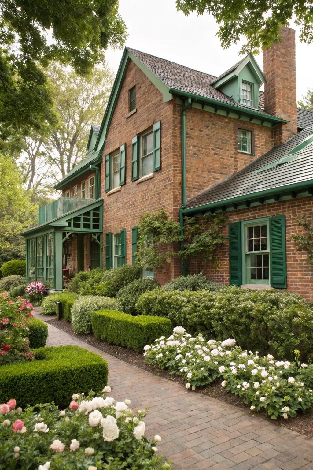
There’s something spellbinding about pairing emerald green accents with brick. This pairing is lush, bold, and brimming with personality—reminding me of grand old estates and secret gardens. If your home is surrounded by greenery or you want to echo the colors of nature, emerald is a stand-out choice that feels both timeless and right-now.
If you’re wondering where to add the magic touch of emerald, consider these spots for maximum impact:
- Front doors: An emerald front door can turn even a modest cottage into a statement home.
- Window shutters: These bring vibrance and a touch of tradition, creating eye-catching color harmony.
- Porch furniture or planters: Emerald seating or oversized pots look gorgeous against brick’s earthy hues.
Color blocking with emerald and brick creates a striking effect that feels intentional and curated. The trick is to keep the rest of your accessories simple—let the green do the heavy lifting!
Ready to try something striking and memorable? Where will you invite emerald into your design?
A few things you might like:
9. Go Nautical Now!
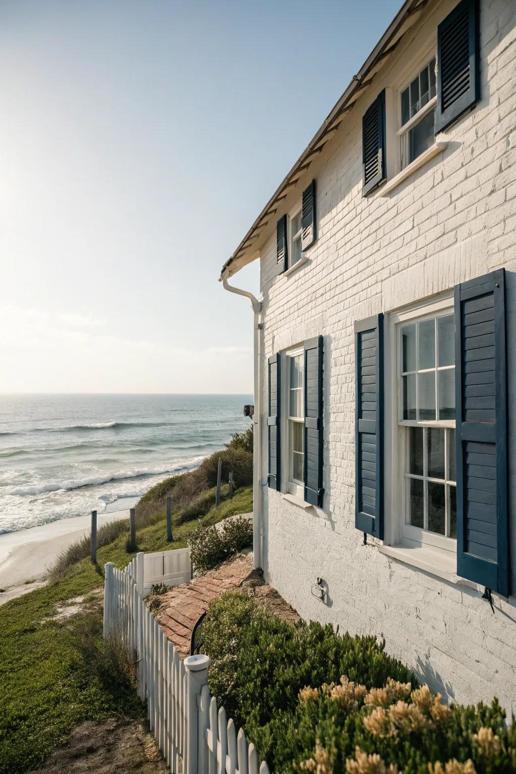
Bring a refreshing breeze to your curb appeal with whitewashed brick and navy blue accents. This combo gives off classic coastal vibes that always look crisp and fresh. Try balancing the look by painting only the shutters or door navy, letting the whitewashed brick shine as the star. It’s a recipe for a bright, open feel—even if you’re far from the sea.
Explore these options:
10. Could Soft Blue Make You Swoon?
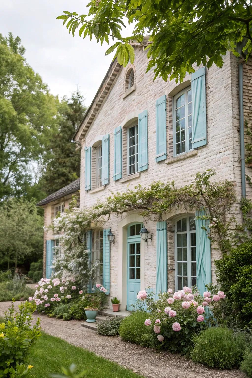
Limewashing brick delivers a whisper of history to your walls, mellowing harsh lines and giving surfaces that soft, cloud-like blur I adore.
Who can resist the gentle charm of pastel blue as a companion?
I once worked with a client, Emily, who wanted her lake cottage to feel serene but still a touch playful. Pairing gentle limewashed brick with powdery blue accents instantly lifted the whole exterior and drew the eye to her beautiful porch.
A few relevant products:
11. Could Black Be Your Brick’s Best Friend?
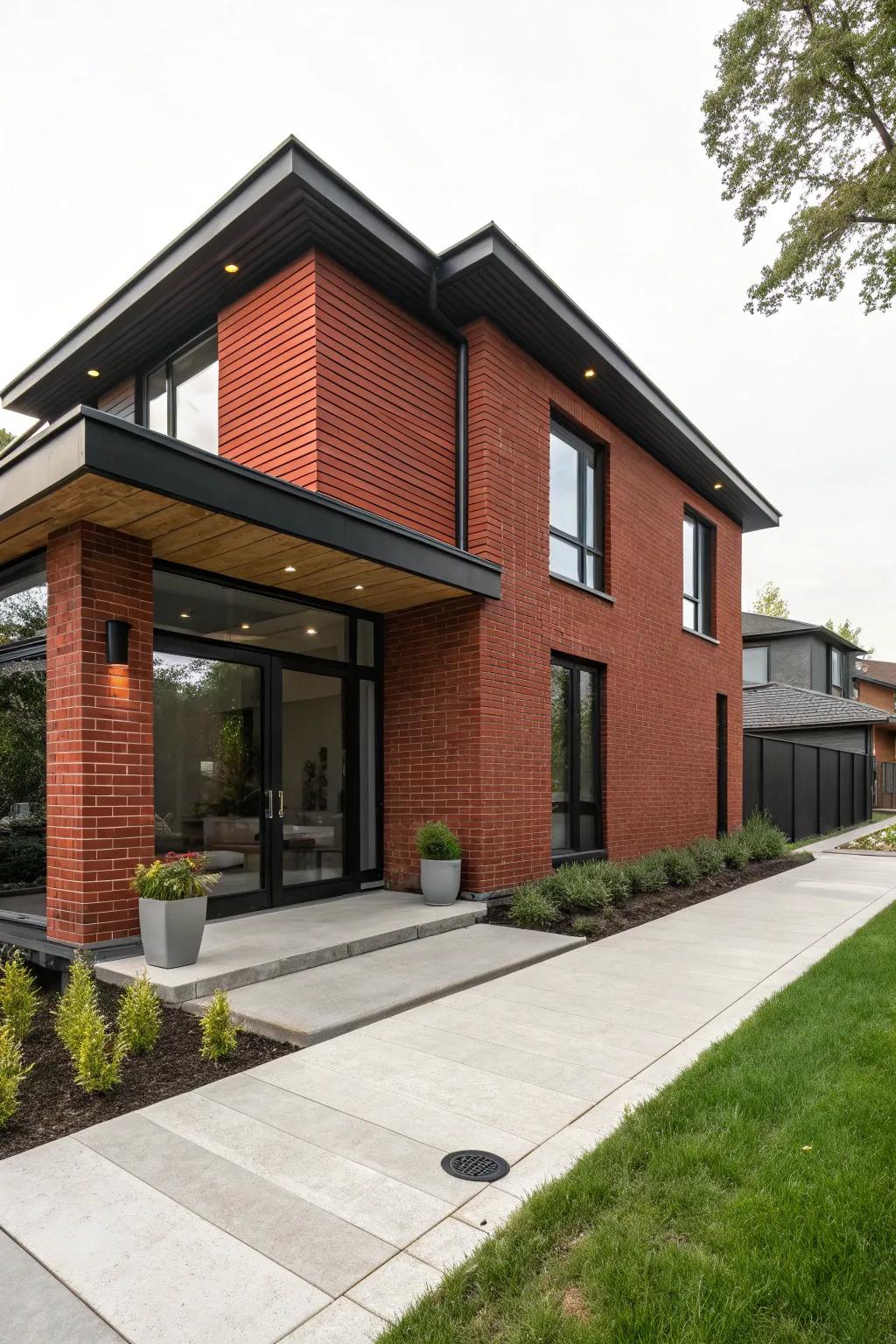
Some design moves are bold—and black trim on brick is one of my very favorites! The moment you pair deep black with classic red brick, everything feels sharper, more modern, and just a little bit daring.
Go dramatic or go home. If you want your architectural lines to stand out and your entryway to feel chic, try this bold contrast. Sometimes, a small brush of black is all it takes to give a house a whole new attitude.
These products might be useful:
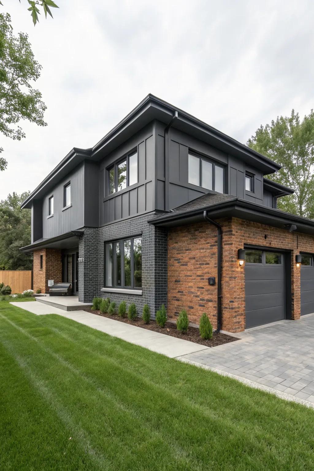
Charcoal gray and brick were made for the modern dreamer. The contrast? Seriously striking.
If you’re aiming for a fresh, contemporary vibe, swap out the beige for this dashing duo.
Try it as a full exterior or just on key architectural features. Trust me, your curb appeal will thank you.
_Dare to be dramatic—sometimes the boldest choices are the most timeless!_.
Products that could assist:
13. Could Teal Be Your Brick’s Best Friend?
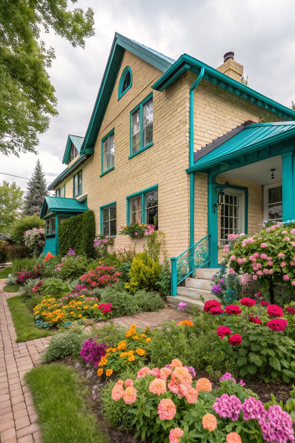
If you’re searching for a way to add personality to your light brick exterior, let me introduce you to the magic of teal! This punchy shade instantly energizes a home’s silhouette, whether you go bold with shutters or sprinkle in a hint with planters. Teal is playful, modern, and just a little bit daring—perfect if you’re ready to break out of the beige rut.
I once worked with Mariah, a client who’d always admired vibrant houses but worried about her own curb appeal. Together, we chose a rich teal for her window boxes and front door, keeping the rest of her facade simple. The result? Her neighbors complimented her daily, and her home became the talk of the block! The key was letting the teal shine against a backdrop of gentle, pale brick.
Teal sings when paired with the right partners. Here are a few ways I suggest integrating it smoothly into your exterior design:
- Try painting just the front door for a pop of color that’s easy to update later.
- Use teal for outdoor planters or garden benches—it’s less commitment than painting trim or shutters.
- Balance bold teal with plenty of clean white or muted gray accents, so the look stays fresh instead of frenetic.
Embracing color can feel like a leap, but isn’t life too short for a dull entrance? Let your home greet you—and everyone who passes by—with a little extra joy.
Possibly helpful picks:
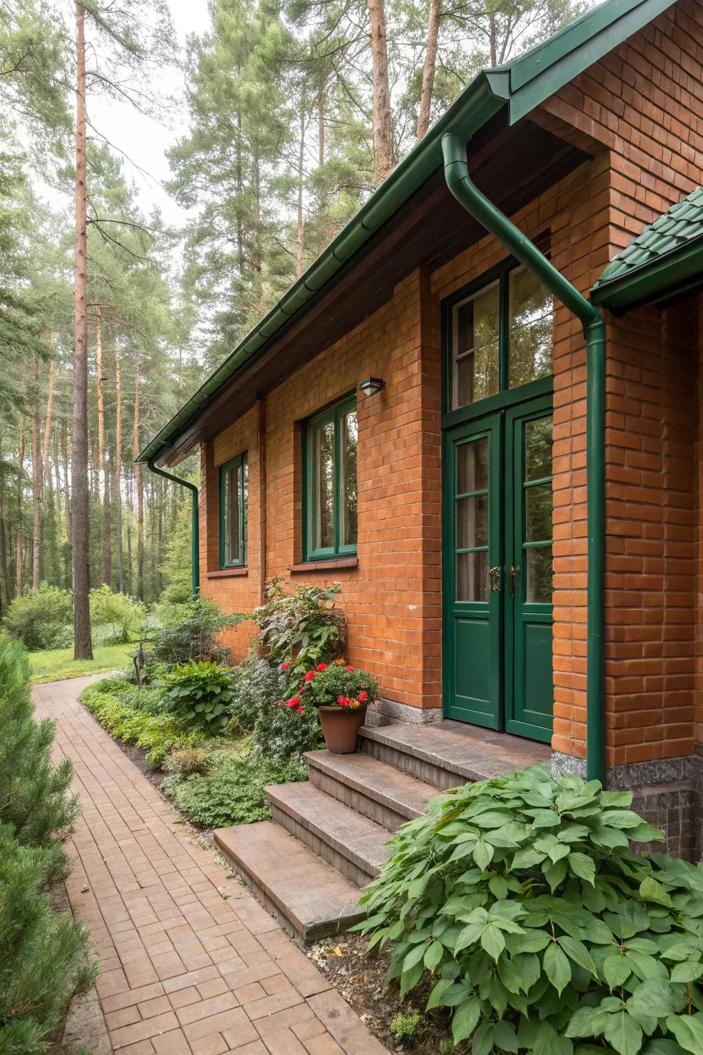
There’s a timeless comfort in combining warm terracotta brick with deep green accents. This pairing isn’t just visually stunning—it brings the outdoors in, echoing the woods and earth right to your doorstep.
- Consider painting trim, doors, or even garden furniture in lush, deep green for an organic look.
- Mix in terracotta planters or brickwork to layer textures and keep things inviting.
- Play with different green tones, from sage to pine, to find your perfect balance.
It’s like wrapping your home in a soft, earthy hug—especially if you’re surrounded by trees or wild gardens. This combo is a perennial favorite for connecting your home to the natural landscape, and it never fails to make guests feel instantly at ease.
Maybe worth checking out:
15. Why Not Blue?
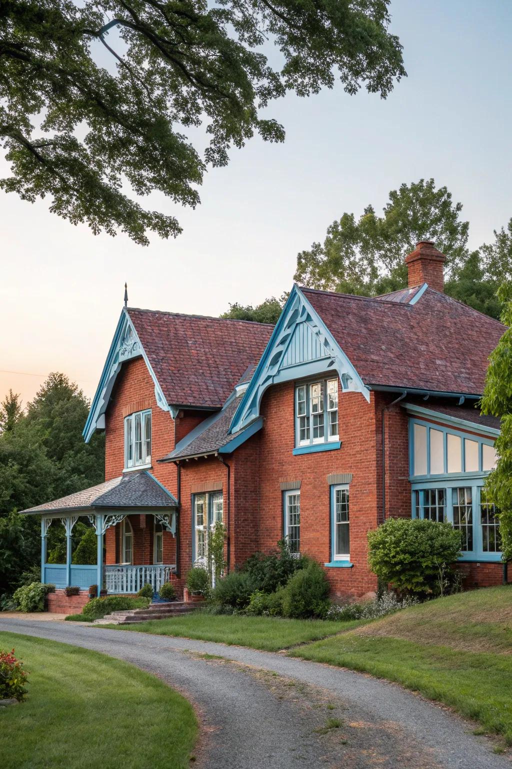
Pairing soft pale blue with earthy red brick is a match made for peaceful souls and open hearts. This palette feels light, gentle, and surprisingly sophisticated—like a breath of fresh air on a warm afternoon.
Ever picture yourself in a calming sanctuary where your exterior says, “Come on in and exhale”? A dab of pale blue on trim or a porch ceiling does just that, drawing out the richness of red brick while keeping the mood soft and tranquil. Don’t be afraid to try this dreamy mix—it’s a classic for a reason!
A few suggestions:
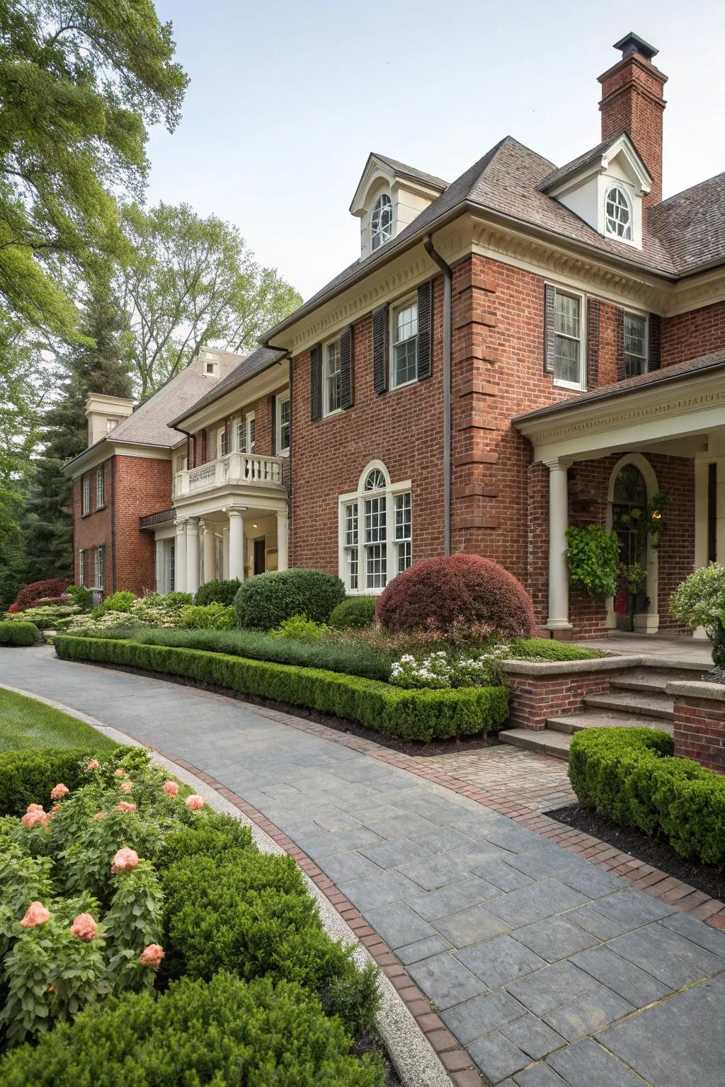
Pairing ivory trim with the deep warmth of red brick is a subtle way to introduce a soft, refined touch to your home’s exterior. The quiet contrast between these two colors has a classic charm that never feels overpowering. If you’re after an exterior that feels inviting—but still a little bit posh—this combination is a graceful crowd-pleaser.
It’s amazing how a gentle ivory outline can frame brickwork so beautifully.
Keeping the trim fresh is key—try giving your ivory a gentle wash every few months to prevent dust and pollen from dulling its glow. If you love a look that’s both welcoming and timeless, this pairing will never let you down.
A few helpful options:
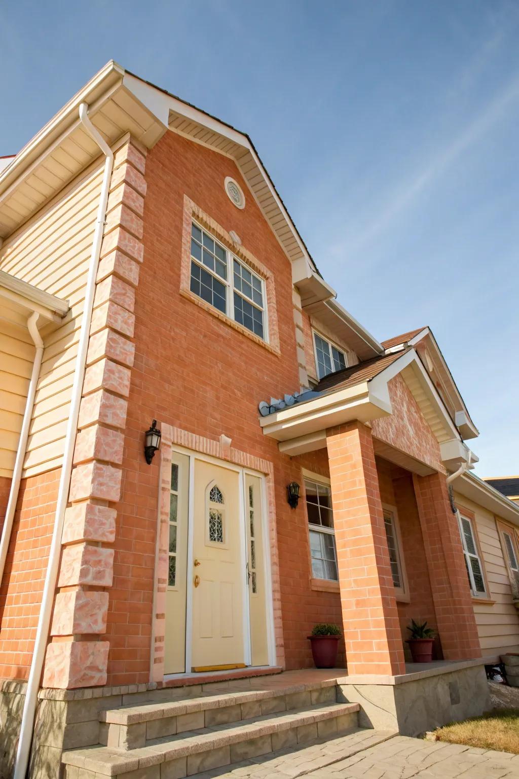
Picture the warm glimmer of a sunrise—those gentle peach tones melting into creamy clouds. Using soft peach brick with cream accents brings this dreamscape to your home’s exterior. The effect? Inviting, bright, and always uplifting.
When guiding clients through this palette, I like to share three essential tips for getting the most out of your peach-and-cream combo:
- Let light do the talking: Use cream on architectural highlights (like trim or porch columns) to capture and bounce sunlight, making everything glow.
- Balance with greenery: Bring in planters, window boxes, or even a climbing vine to add freshness and contrast to the softness.
- Choose simple accessories: Keep hardware, lights, and furniture minimalist so the color story takes center stage.
I’ll never forget working with Lena and Gabriel—two artists who wanted their little bungalow to “feel like the morning.” We picked a pale peach brick with creamy fascia and installed round outdoor lanterns at the entry. Lena added oversized planters with feathery grasses, creating a playful movement that guests noticed immediately. Their reaction? Pure delight, every single visitor.
Whatever your house’s style, a peach-and-cream scheme welcomes everyone with its gentle charm and open arms. It’s approachable, a little bit whimsical, and full of optimism.
_Warmth is a color, and it starts right at your door._
Possibly handy products:
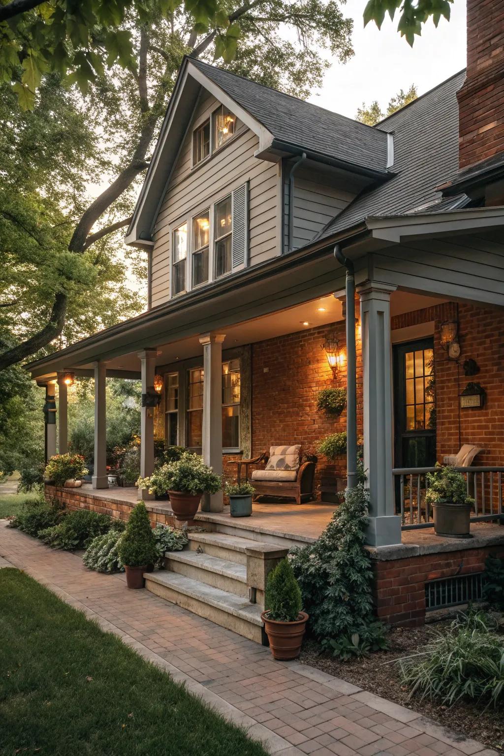
Combining warm gray with rustic brick is one of my favorite tricks for creating an exterior that feels modern but never cold. I helped the Watson family choose a smoky gray trim with their rugged brick, layering in brushed metal lighting and cozy woven mats for added texture. The result was a space that felt fresh and current—but still hugged you on arrival. Don’t be afraid to mix different materials to keep the look interesting and inviting!
Useful items to consider:

There’s something spirit-lifting about walking up to a home dressed in muted yellow and classic brick—like a sunny hello with the elegance of an old friend. This blend always makes me smile, and it brings out so much character in an otherwise traditional facade.
Muted yellow is a color with a foot in two worlds: warm and cheerful, yes, but also quietly refined. Its soft golden undertone pairs so well with the earthy depth of brick, creating a welcoming front that doesn’t shout, but rather glows. Psychologically, yellows evoke optimism and friendliness, lighting up brick walls while keeping things grounded and timeless.
I still remember working with Linda and James on their home’s exterior renovation. They wanted something “classic, but not boring”—something that radiated hospitality. We tried out several shades, and when we finally brushed that cozy muted yellow onto the trim, their whole entryway transformed. Suddenly, their brick facade felt alive and inviting, the kind of place you’d want to stay for one more cup of tea on the porch.
- Use muted yellow for trim or entry doors to add a pop without overwhelming the brick’s natural beauty.
- Pair with natural wood accents—like shutters or porch rails—for extra warmth and cohesion.
- Consider subtle outdoor lighting in brass or gold for evening ambiance that highlights those inviting tones.
Let muted yellow be your home’s warm handshake to the world.

